Game UX Notes
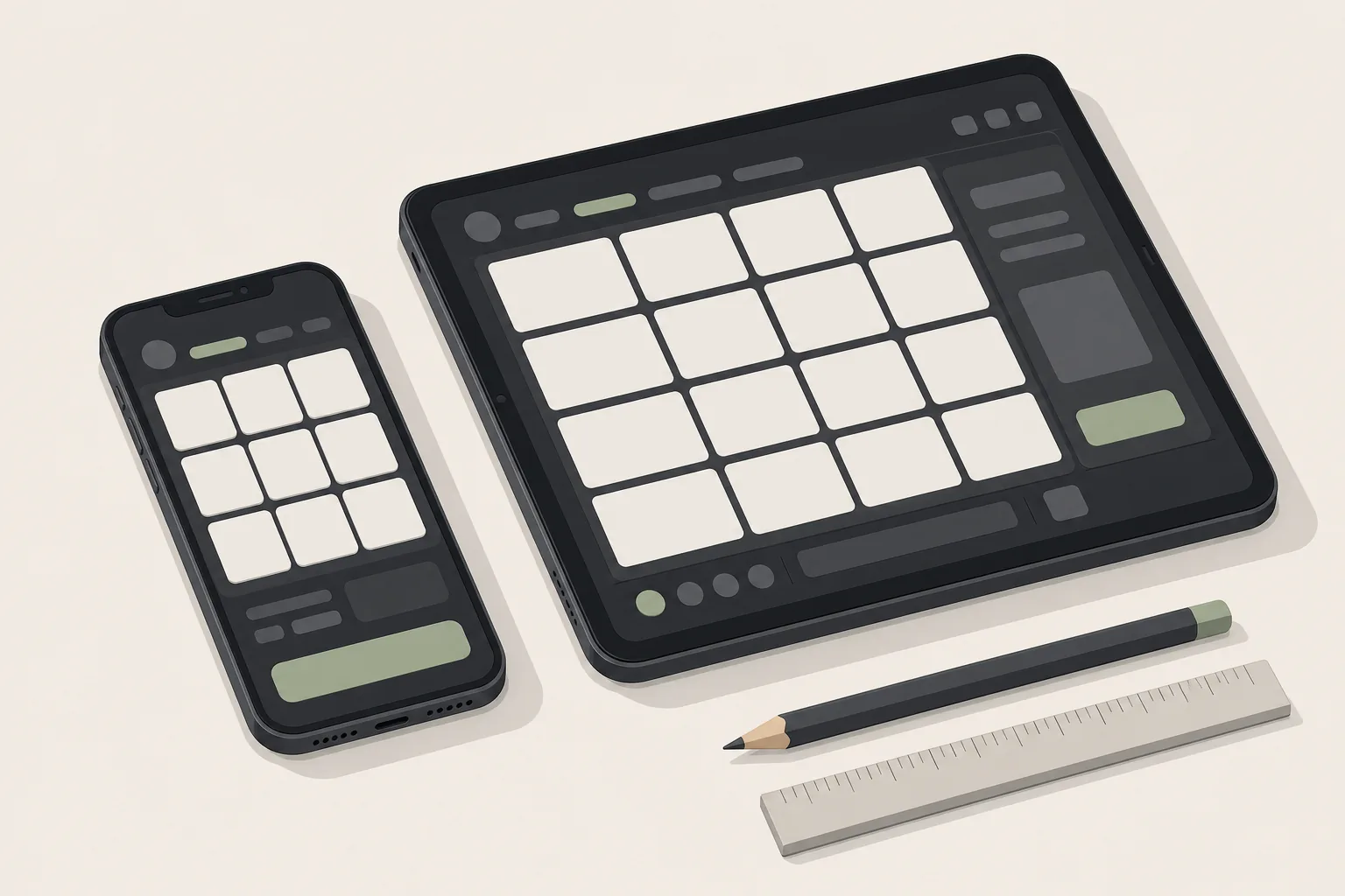
Notes on how gaming products feel to use, written by someone who designs them. Lobbies, game clients, onboarding, the small decisions that make a slot feel fair or a lobby feel like a wall. Personal opinions, no affiliate links, no rankings.
Latest notes
- Casino lobby UX: the filter bar does more work than the hero — most players arrive knowing what they want; the lobby's job is to get out of the way.
- Demo mode is a UX feature, not a marketing one — free play is how people learn a game's rhythm before they pay for it, and the regulatory constraints around it in Great Britain shape the whole flow.
- Slot load time is a UX metric — the four seconds between tap and first spin decide more than the art does.
- Explaining RTP and volatility inside the UI without a lecture — the information is mandatory; the understanding is not, and that is the design problem.
- Accessibility in casino UI — contrast, motion, one-handed play and reading order, applied to a screen full of spinning things.
- Designing within RTS 14 — what a 2.5-second floor and a ban on celebrating losses do to animation budgets and feedback design.
What this site is
A working notebook by Rory Finch, a product designer in regulated gaming. The notes are opinions built on the day-to-day of designing these products, checked against public documents where a rule is cited. There is nothing for sale here and nothing to sign up for.
If you are a player rather than a designer: the notes may still be useful for understanding why a game behaves the way it does — and if the way it behaves has stopped being fun, the helpline at the bottom of every page is free and open all day.